This is the Main Headline. To Learn How I Created it, and How You Can Too, Read the Text Below!
This is a Sub-Headline. It Should Also Usually Be in It's Own Row and Full Page Width. There Are Several Flavors of Sub-Heads as You Will See.
This is a full column text block.
Now, I'm going to tell you how to edit the headlines. First, use a text block and not a headline in the elements. It's easier to move and format later.
Second, the standard headline font is Oswald. You'll find the font settings by clicking the green "advanced options" button.
Alignment (left, right, center) will be here. Usually we choose center, but there are times where left looks as good if not better. Use your judgement. DO NOT SET ALIGNMENT WITH THE TEXT EDITOR. USE THE ADVANCED OPTIONS ONLY.
Once you set the alignment, there will be a section to set the font face. As I said before, headlines are in Oswald.
Now, select your font size. Headline sizes are the following based on the aesthetic - use the size that looks best to you knowing it needs to really stand out: 31px, 33px, 39px, 42px, 51px. Generally the only headlines that will be 42 or 51px is the main one at the top.
Style will almost always be normal or bold. You can try thin to see if it looks good. The rule of thumb is "looks good."
Choose your color. I use two standard colors: #000 (black) and #c00 (dark red). For each project I will also give you a list of HEX colors (#XXXXXX) that you can use to make the text look interesting and pop.
When using Oswald, always set the spacing to -1px.
We don't use shadows. Ever. They suck.
Also, for plain headlines (not the ones with colors behind them that I'll show you in a minute), be sure to set the text bottom padding to 21px.
If the headline is greater than one line, then try to balance the text. What I mean is that you don't want 20 words on line one and 3 words on line two. Break the text up by picking a spot and hitting "shift enter". That gives a line break instead of a full return.
Lastly, at the very bottom, there will be a line spacing option. I use these basic rules to help me get it right:
If the font is below 35px, use 39. If the font is between 35 and 39px, use 42. If the font is 42px, use 51, and if the font is 51px, use 63.
This is a Colored Headline Background. Here's How to Create Me.
First, let's talk about basic row settings. To edit a row's settings, click on it's pencil (similar to how you edit elements within rows).
All rows should have the "Is this a full width row?" checked. Additionally, you can adjust the bottom and top padding numbers (these are in pixels), but generally, you want them set to zero.
One of the exceptions to that is when you create a colored headline.
To create a colored headline, you must first create a new row. Once you've created the row, you'll need to go into the row settings and make sure you've checked that it is a full width row.
Next, you'll want to set the background color. Usually this is to one of the colors I'll give you in HEX code to match the color scheme of the page.
Finally, set the top and bottom padding to 21px.
Once that's done, you're going to create the headline using the same directions in the headline section with two important differences.
First, the text will likely need to be white (#FFF). Second, you will set your bottom padding to be BLANK. This ensures that the space at the top and bottom of the headline block is even.
A Note About Text Boxes
Generally, I like each paragraph to bee in it's own text box so that I can easily drag them around and move them if I need to edit your work.
I'll explain why in the next section on multi column rows.
This is a Headline Above a Multi Column Row.
It ALWAYS Needs It's Own Row.
For the most part (there are exceptions, and we will talk about them when they come up), You use a two column row when you have pictures.
This is also the section where I'll start putting paragraphs in separate element boxes.
The reason is that it makes it easier to move text around pictures. You'll see and example of this very soon.
Now, a word about images. Generally, I'll make sure you have pictures that are the right size. Optimize Press will automatically size it to fit the container UNLESS it's too small.
Now, before we continue with pictures, you'll notice the text in the previous paragraph dipped below the bottom border of the image. As a result, I added a new single column row, which allows the text to appear to wrap around the picture.
Now, back to images. If an image looks too high or too low, we can change the vertical position by hovering over the image, clicking the pencil to get into the settings and adjusting the TOP margin.
A Top Margin of 0px places the image at the very top of the container. A positive margin (11px, for example) moves the image down while a negative margin (-11px) moves the image up.
Also, I try to alternate image sides just like on this page. If the last one was on the right, the the next one will be on the left. The exception to this if you put the image on one side or the other and it just looks bad.
That said, don't put two images right underneath each other without text if at all possible. There is an exception however, and we'll talk about that shortly.
We Can Also Put Text on a Colored Background
If We Need to Keep the Visual Interesting
If you get into sections where it's just long blocks of text, sometimes you can break it up with a colored background for a section.
This, very obviously is an example of that. To make this happen, you put in a hex code in the "Row background color start" box. If you'd like the color to fade out at the bottom of the row, then you can put #FFF in the "Row background color end" box. But only do this if it makes visual sense.
What About Bullets?
Now, let's talk about "Bullet Blocks". In all honesty, they are a tad cumbersome, but they look good.
- First, you want to add a new element and select "Bullet Block".
- Next, select the Large Icon. Here you'll be able to select from a pallet of images. My rules, select checks (the flat ones, not one's with a shadow) for "good" things.
- Select any of the red "x" icons for "bad" things.
- And select a arrow or star icon for just things.
- For arrows and checks, choose a color that makes sense. When all else fails, green or black for checks, and black for arrows.
- Next, you'll see boxes in the editor. Enter one bullet per box.
- Either click "Add New" or hit enter to get a new box.
- Now hit "Advanced Options". Make sure your fonts are set up correctly. We generally use the Lato font at 19px and #000 as the color hex. No shadow, no spacing - don't touch those boxes.
- Finally, you can adjust the box width. This is basically the indention of the bullets, but it indents from both size. Leave it blank if you want the bullets to stretch the entire width. Enter 600 or 700px to shrink it. This one is set to 700px.
- Unless you can find a compelling reason, always leave the alignment set to center.
- You can change the icons for different bullets by creating an entirely new bullet box.
- If you do this, make EVERY bullet a new box because it leaves extra spacing between them (as you can see) and it will look goofy if one bullet has more space than the others.
Feature Boxes and Price Boxes - One Animal, Two Uses.
A price box is included for you below (in a new row). Just copy the row and paste it to your document.
IMPORTANT SIDE NOTE: You can copy rows between pages/documents by opening two live editors in separate tabs, clicking the "Copy Row" button on the row you wish to copy (the first icon with two sheets of paper - one big, one little) and the clicking the "Paste" (the clipboard) button where you want the row to go in the new document.
$297 $27

A price box is just a glorified "Feature Box". A feature box is a cool way to build boxes that contain text and borders. They call out information. Now for the instructions.
Creating the feature box is pretty straight forward. Here's how to do it:
Start by adding a row, then an element and select "Feature Box Creator". There is only one style available, click it an move on.
Now, you'll see a text editor. IGNORE IT.
Instead, go directly to "Advanced Options".
Skip the text formatting part. We will worry about it later.
In the "Width" box, just like the Bullet Block, choose something less than 800px. That shrinks the box and makes it stand out.
Ignore the margins, but set the padding to 21px or 33px in all 4 padding boxes (top, bottom, left, right).
You can change the background color just like you do for changing the background color of a row if you want (or need).
We will ALWAYS set a border color. This border color will come from the HEX colors provided for the site. Choose a good one.
Set the border thickness at at least 6px. Set the radius however you wish. The radius rounds the corners. This box has corners set at 13px.
Finally, choose a solid border unless there's a compelling reason not to.
Now, click insert. You'll get a box on your page with an "Add Element" box inside of it. Here you can add text, bullets, images, etc.
You can edit the format of the box container by clicking the square to the left of the pencil in in the options that appear when hovering over the box. Click "Advanced Options" and you're back to options to change the border color, padding, etc.
Now, and this is VERY IMPORTANT (and this bold). You cannot drag stuff in to or out of feature boxes, so make sure that you to create a feature box with a purpose. If you do one where you don't need to, or you don't create one when you should, there is rework.
To edit the content in the feature box, just click "Add Element" again, it will open up everything you need.
The last thing to note is that you edit the price box the same way. Some people like their product images in there. Some headlines, some both.
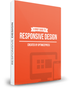
Product Images - The Exception to the Rule
The Name of the Product Component (And It's Value)
This is where the description of the the product component would go. We're going to use this space to describe some nuances of both the product rows and text editing.
First, the headline of the product component is Oswald, 23px, -1px spacing. You'll also notice that the value text is red.
To do this, highlight the text, and click the A button (capital A with a line under it) and select a color. This is a standard color pallet.
However, if you click the "Text" tab in the upper right of the editor, you'll get an HTML editor. There you will see a HEX code. I always pick a standard red color for the value part of the headline - this generates the HTML code for you to turn the words red - and then I edit that HEX to #CC000 so that it's the shade of red I want.
Also, with some exceptions, we will not wrap the text around the product image in product component rows.
The Name of the Product Component Number Two (And It's Value)
This is where the description of the the SECOND product component would go. And you basically just repeat this process until you have all of the components done.
Occasionally, people will want bullets here. Do the bullet block just as before, but this time leave the width settings blank and allow it to fill the space.
And, every so often we'll be asked to alternate the product images from left to right. We've already covered that above.
Product Downloads.
We will need to build download pages as well. Generally, we only need the URL to the download to accomplish this.
Here's how to generate the download segments:
We are going to add an element and select "Files Download".
Next, select the FOURTH style down - the one without a border. Click "Add New" on the next screen.
Now, select an icon. I prefer the flat black ones at the bottom. Select one that makes sense for the type of download.
After that, click "Select File". An "Add Media" box will open. 99% of the time, you're going to want to choose "From URL" and paste in the URL. Once it's pasted, select "Insert Into Post".
Now, enter the name of the download, and it's size if I've sent it to you. We don't generally want it to open in a new window.
Add the description if you have it, if not, leave this blank.
If you have more than one download that goes in this section, click "Add New" under the file description box and repeat the process.
The Last Thing, For Now... Videos.
Very often on upsell pages (you'll know which ones they are), we have to put a video at the top.
Here's how that works:
Add and element, choose video player and select the only video player style available.
Now, on "Step 3" under "Type", we are generally going to choose "Embed Code". Paste any video embed code I've sent into this box.
Choose the dimensions that look best on the page. This might take a little trial and error.
Leave everything else as is, and BOOM.